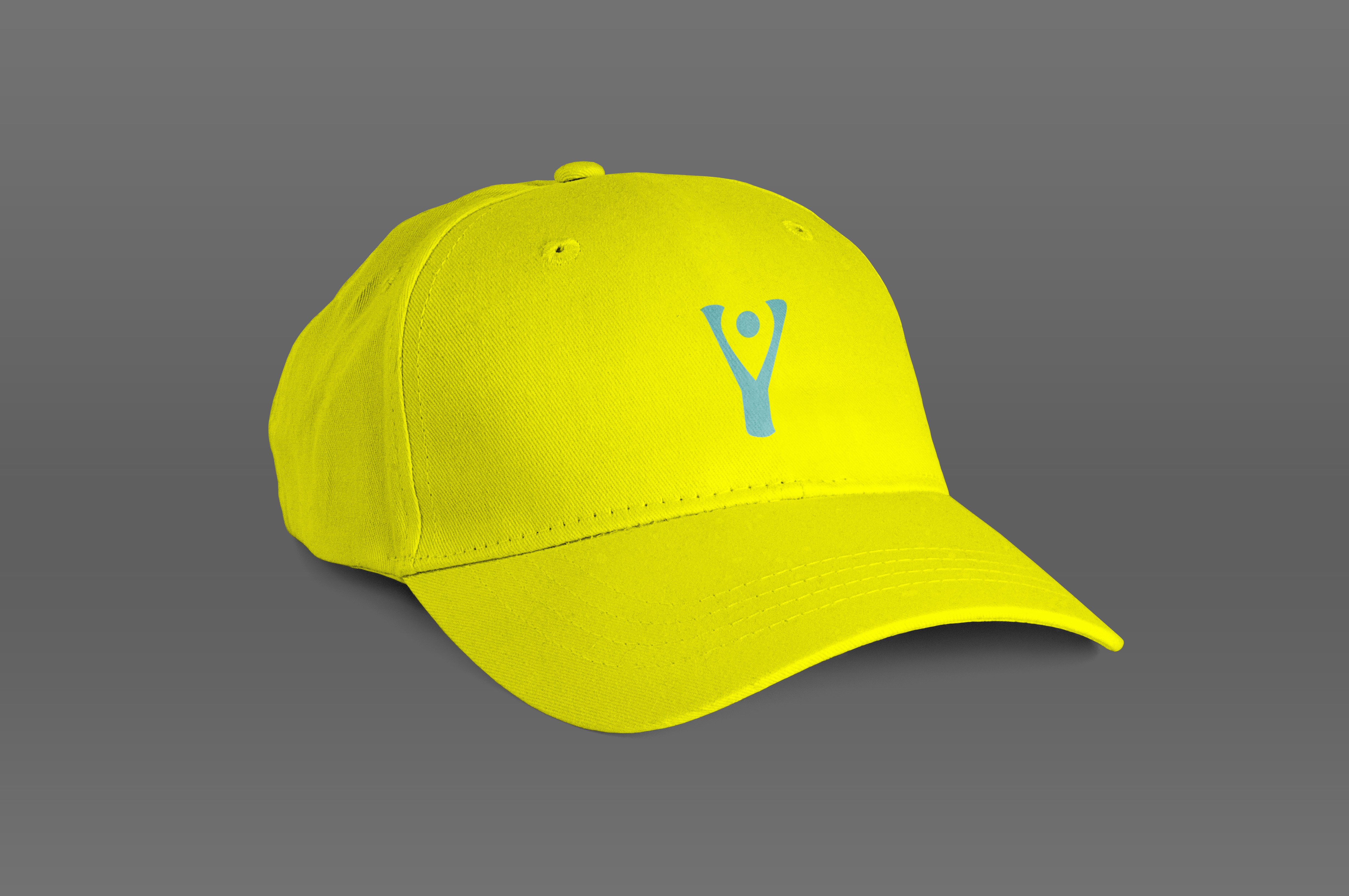
Y Axis Vacations Logo Branding
Brand Identity
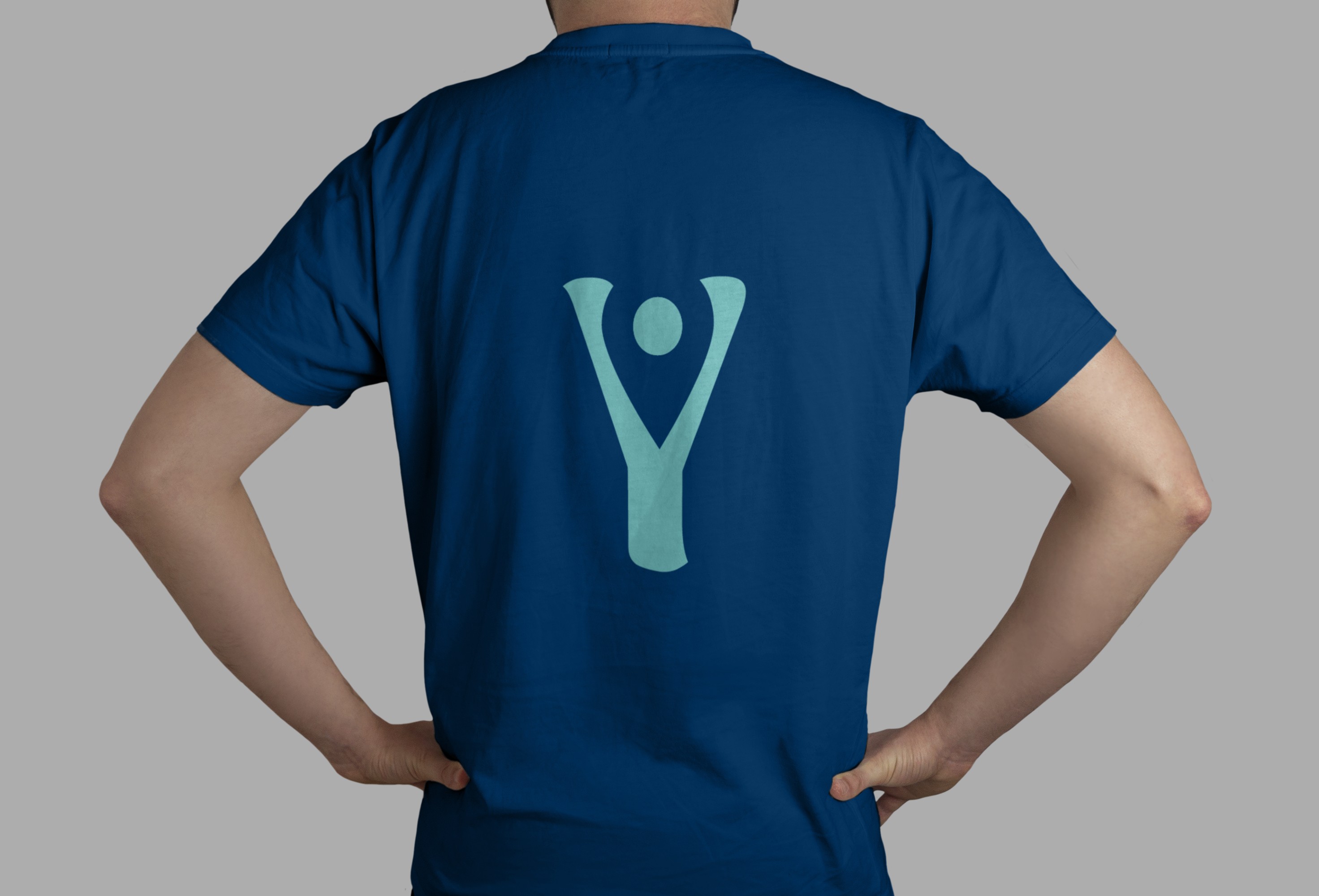
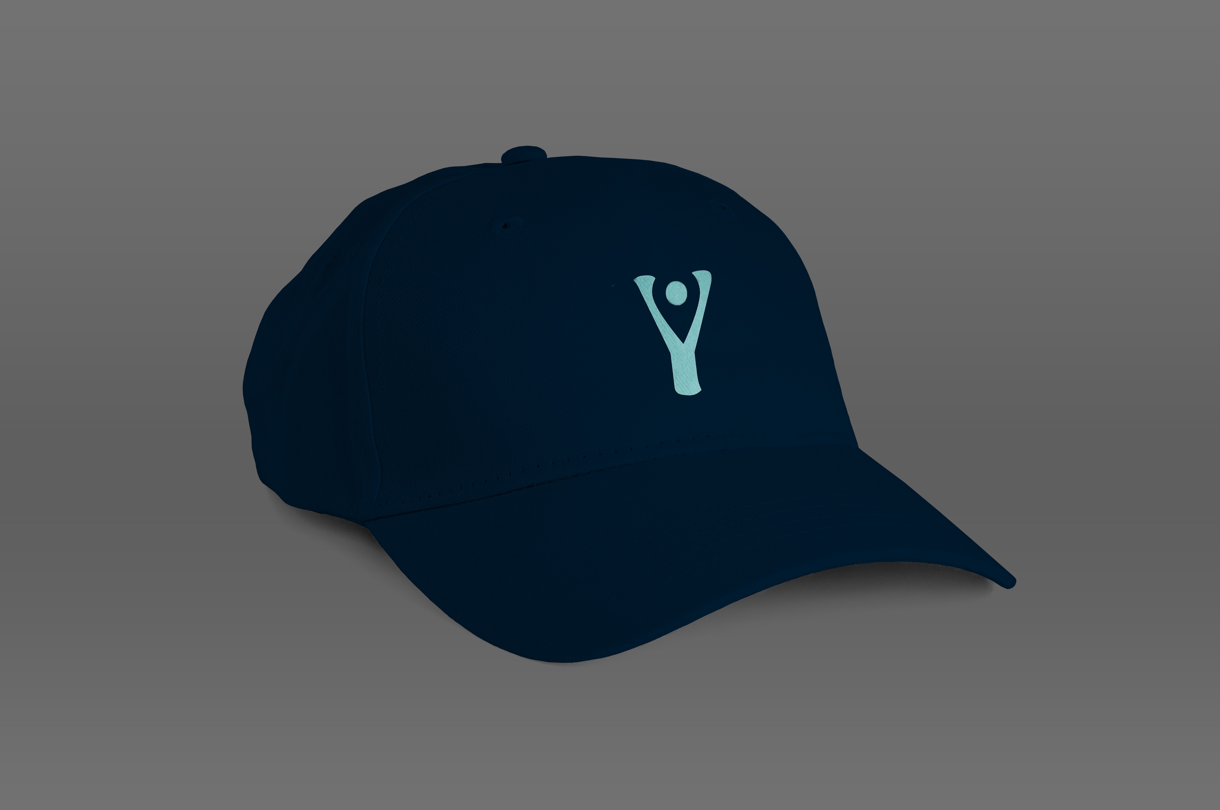
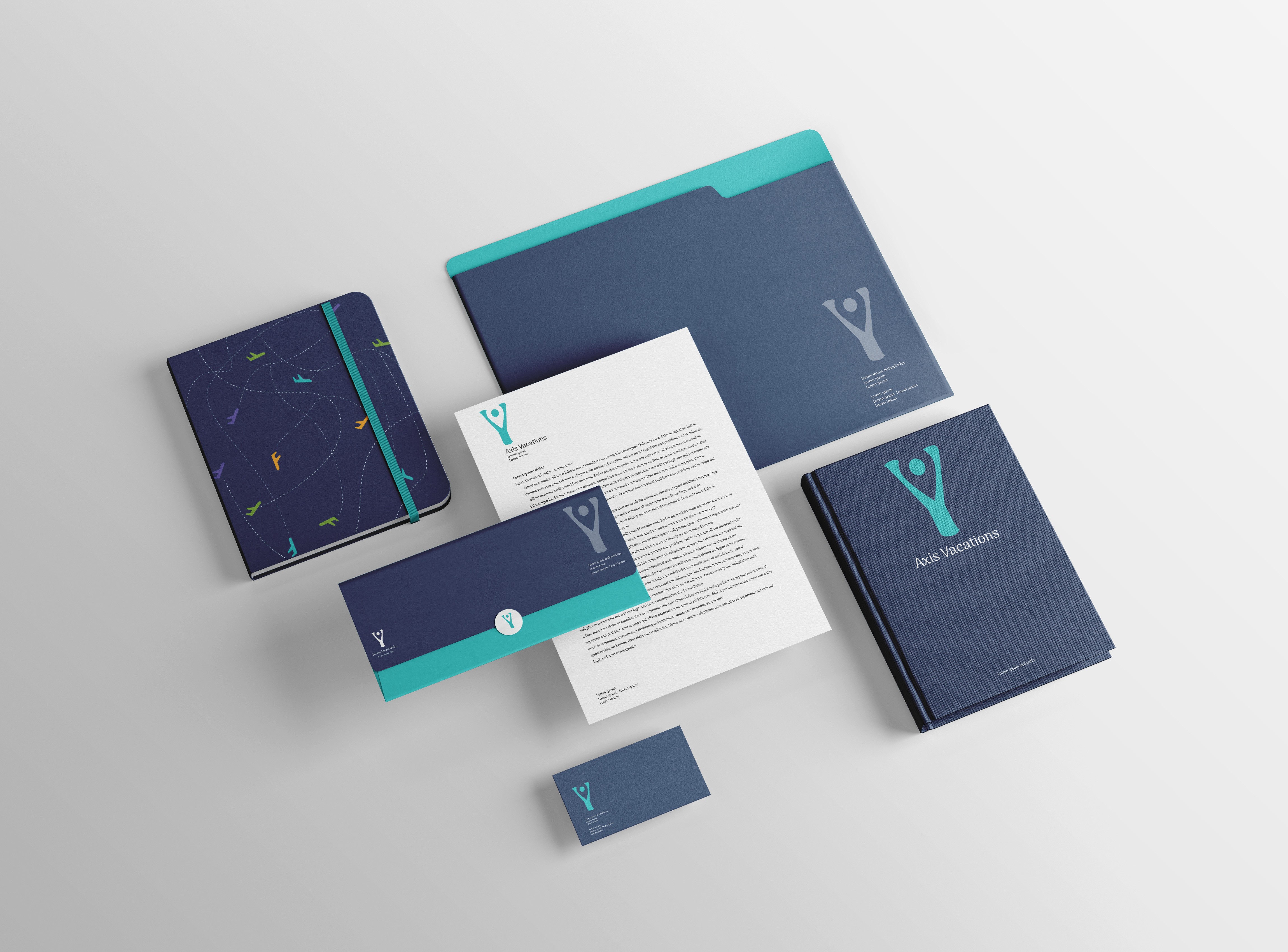
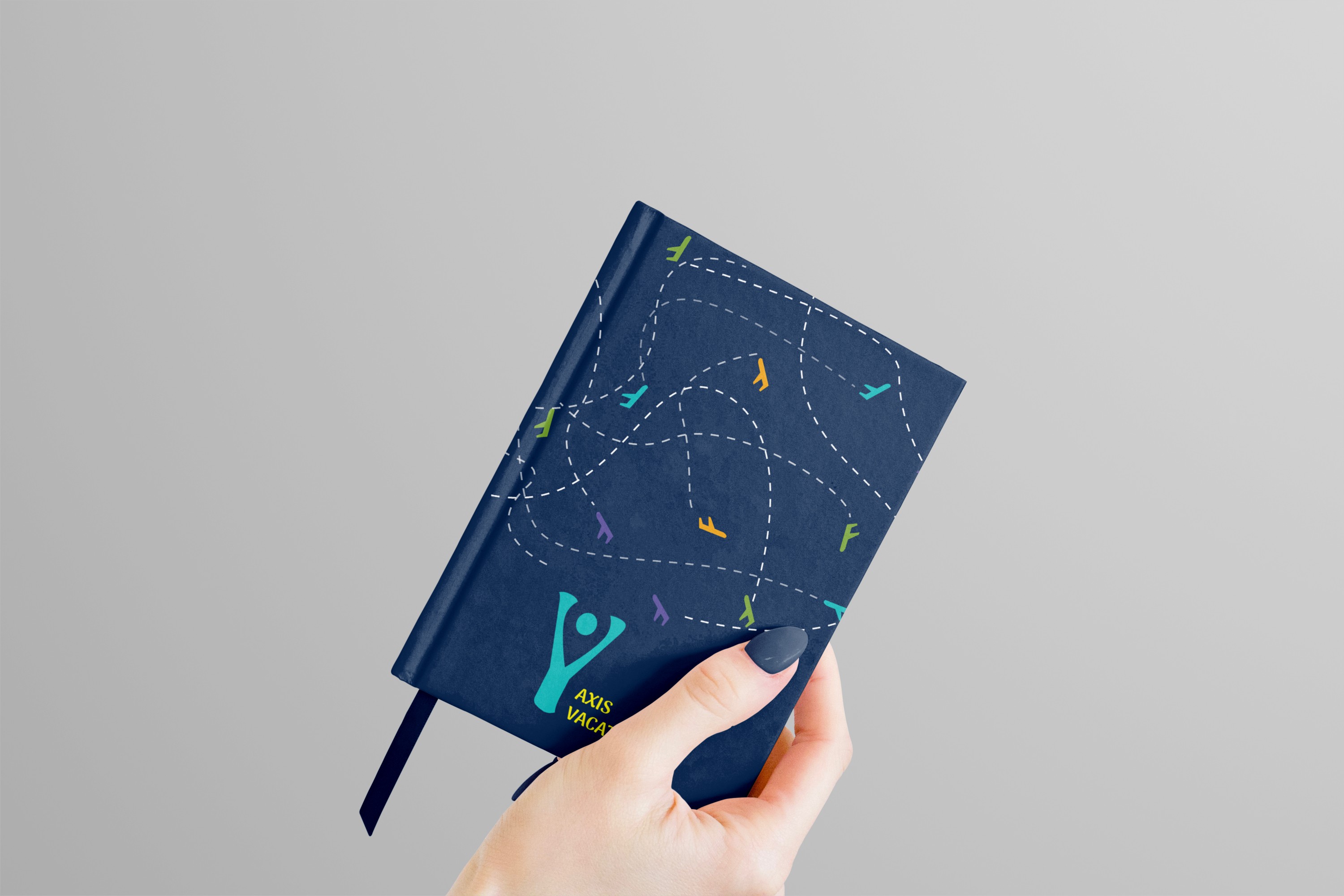
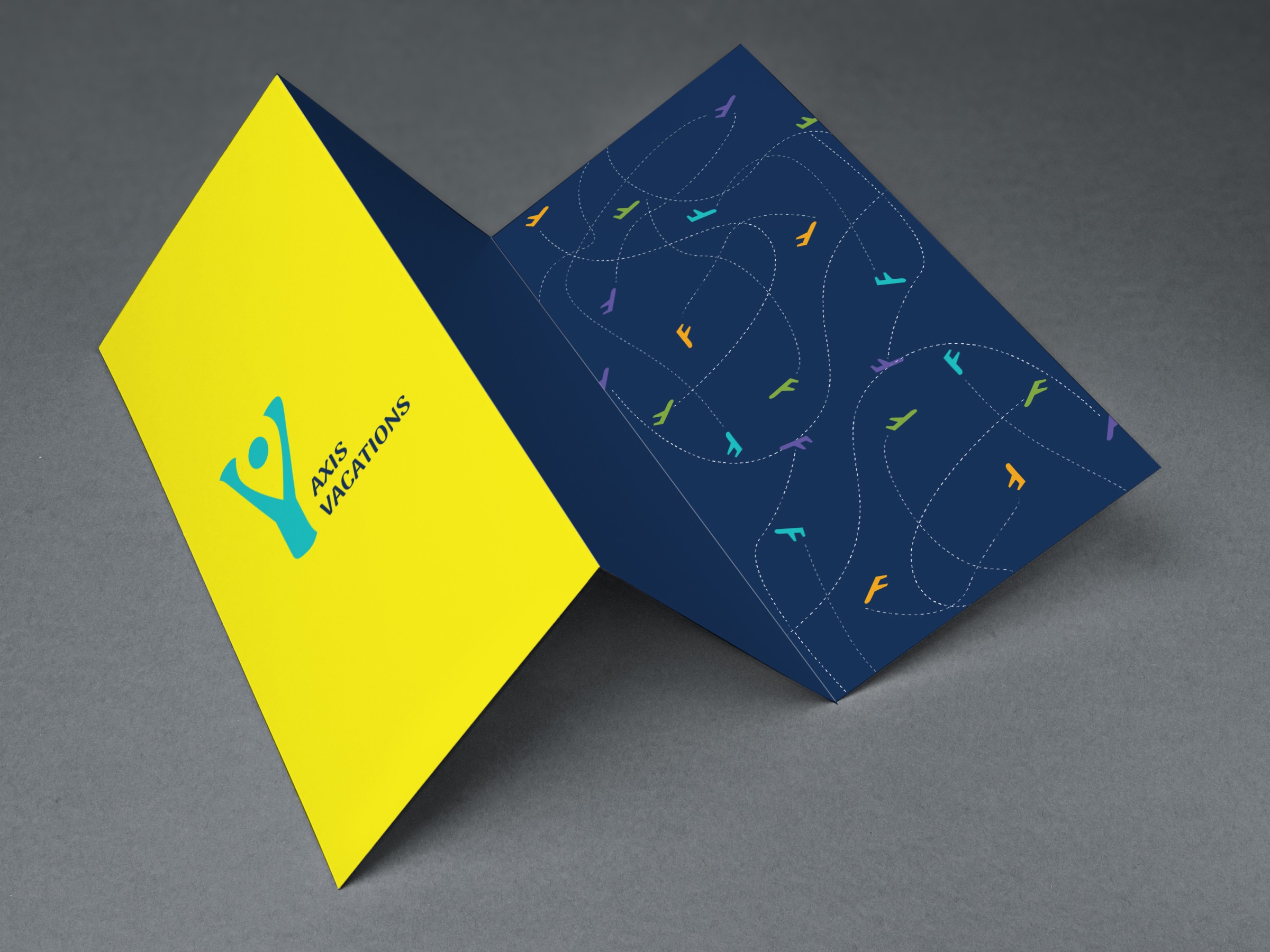
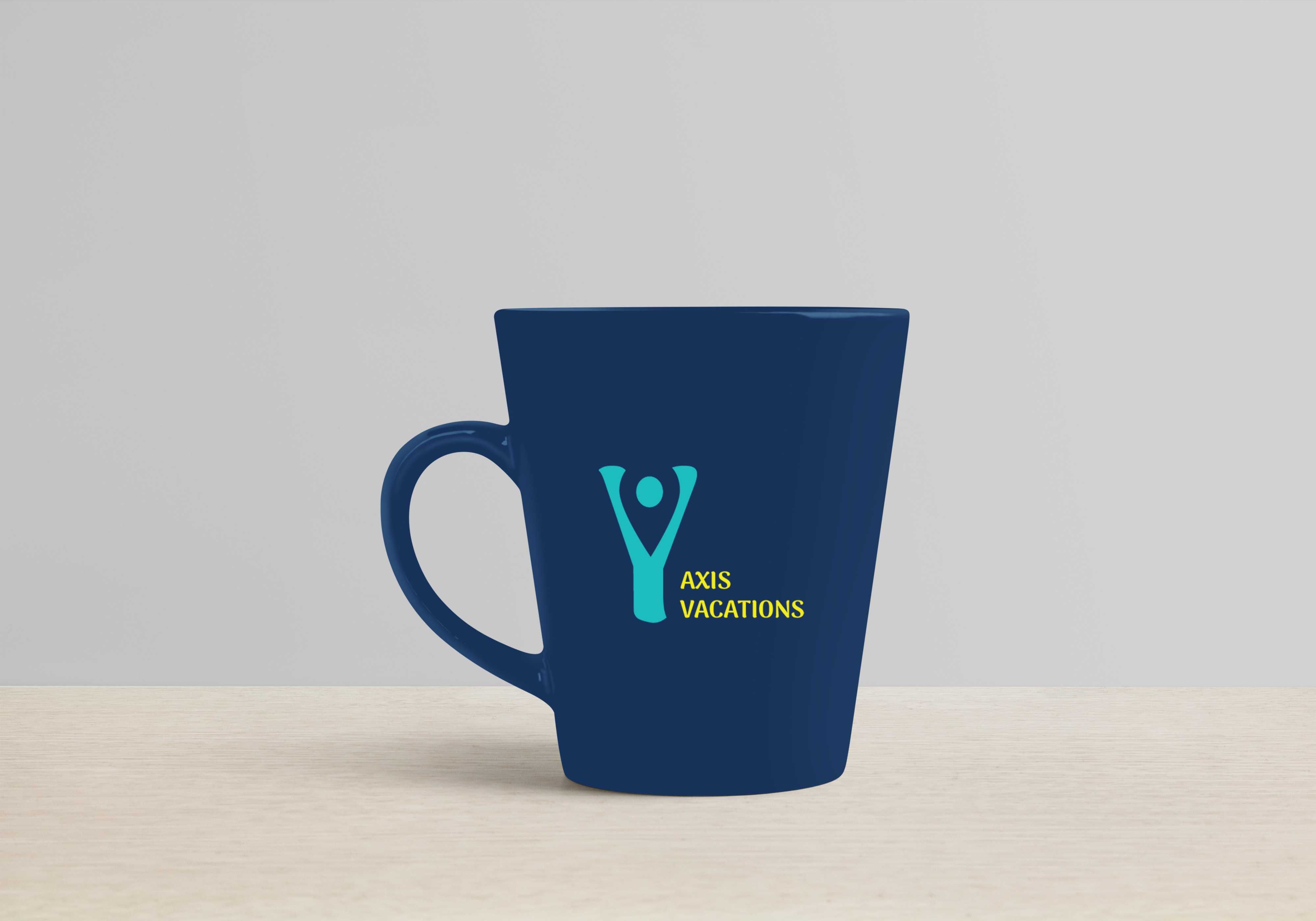
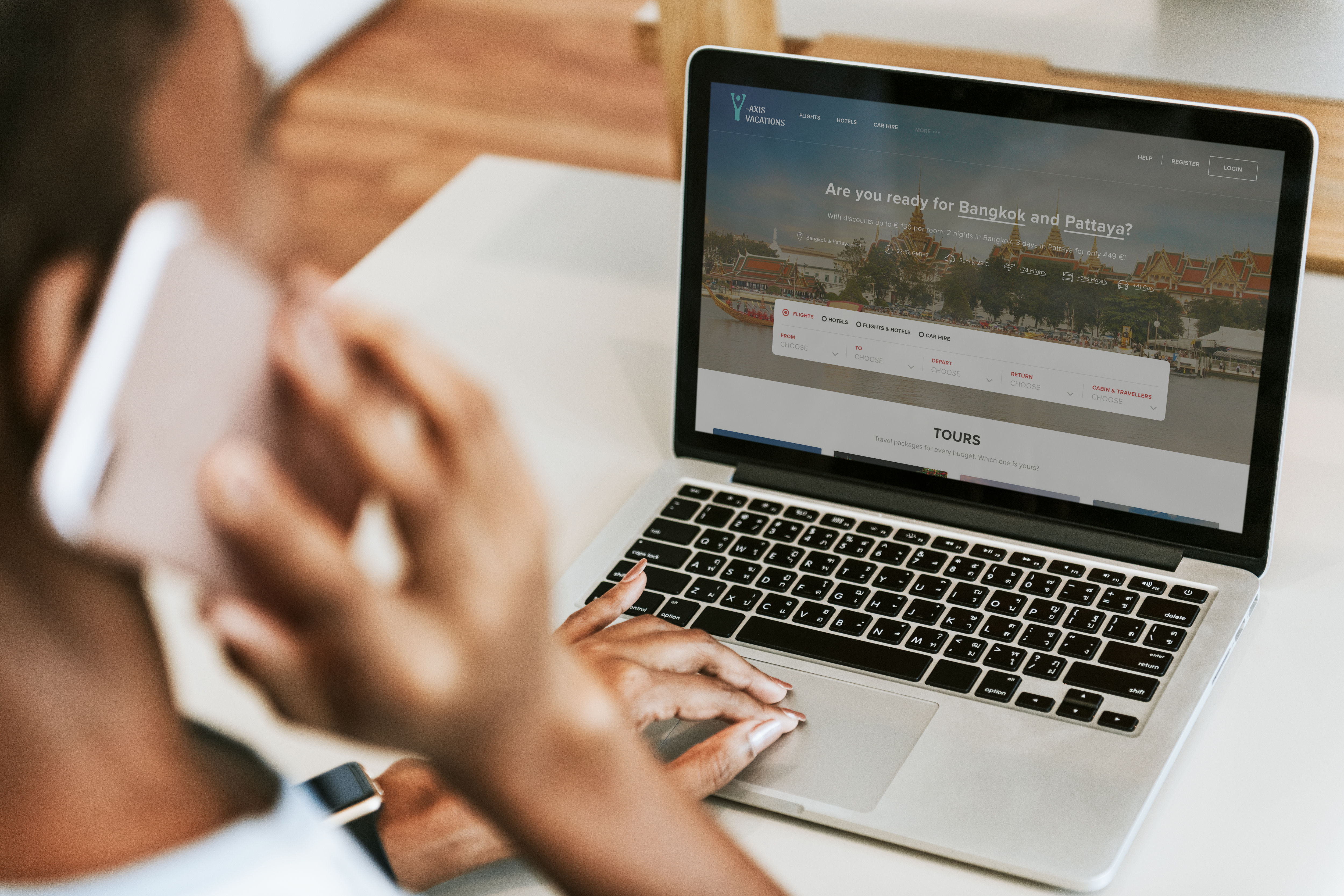
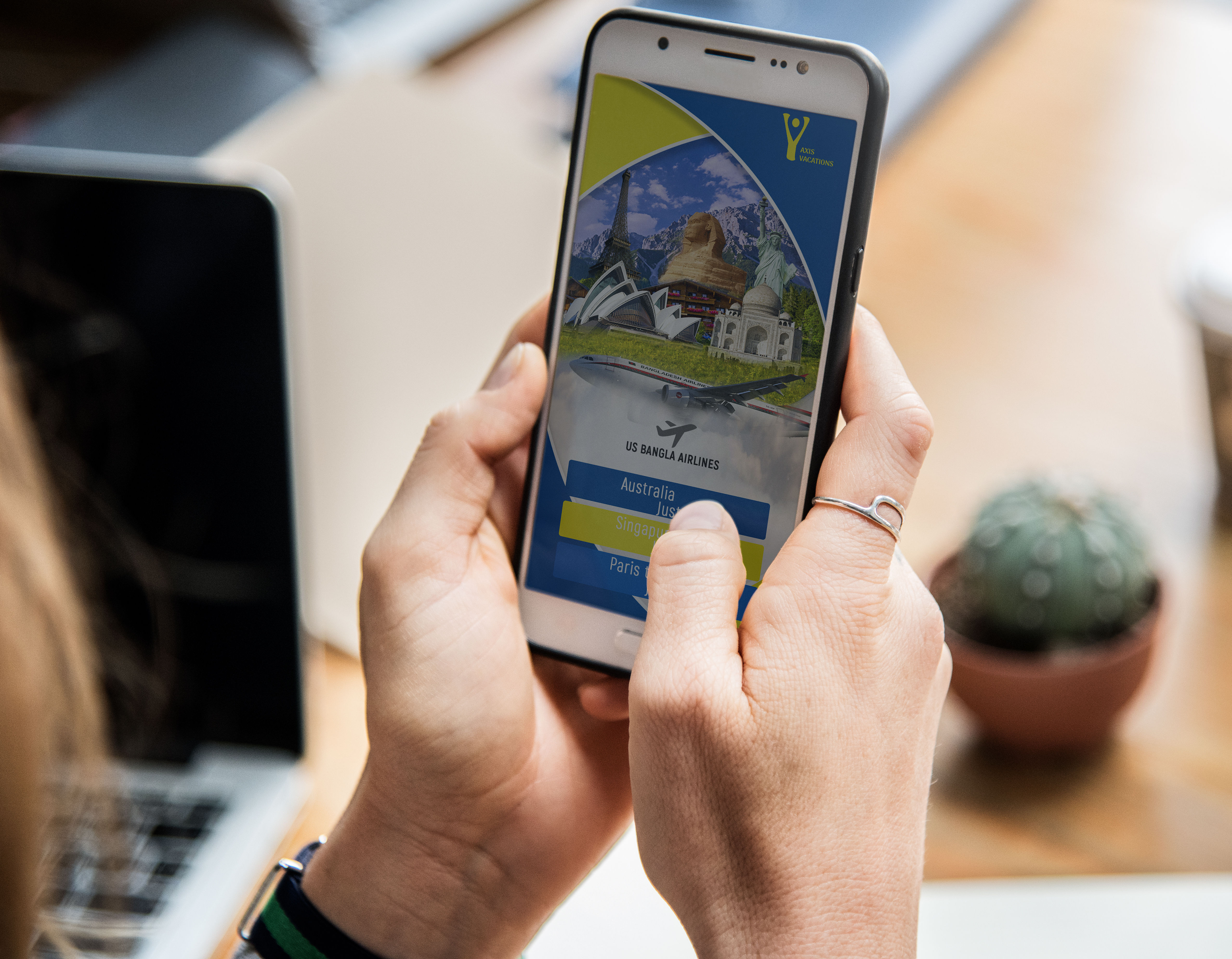
The logo follows the negative space rule and features a vertical letter Y with the location mark combined into the negative space that represnt a travel servies company. The colors used in the logo are blue for water, and yellow for sun and happiness. Overall, I am quite pleased with how the logo turned out, and it effectively captures the purpose of the company's mission and attract people who look for a special travel services.
Deliverables:
Logo.
Prints.
Promotional Products.
